Archives for the month of: February, 2012

Designer: John Fontana

Illustration: Helen Musselwhite

Publisher: Doubleday Canada

The illustration on the cover is lovely. It combines mystery and fantasy. The circus seems to float above the hand and the gesture of it leads the eye to the circus in the center. The embellishment goes well with the clean illustration. The two typefaces have various weight that matches the embellishment. They also help create the fantasy atmosphere on the cover.

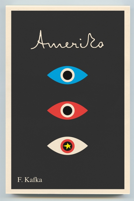
Designer: Peter Mendelsund
Publisher: Schocken

Peter Mendelsund redesigned a series of Kafka covers in 2011. I was attracted to the covers by their simple geometric shapes and vibrant colors. Eyes are used on all the covers. The designer used different combinations of color and manipulation of eyes to express the theme of the book. According to Peter Mendelsund,

“I find eyes, taken in the singular, create intimacy, and in the plural instill paranoia. This seemed a good combo for Kafka- who is so very adept at the portrayal of the individual, as well as the portrayal of the persecution of the individual.”

The font used in the title is derived form the handwriting of Kafka. It is a nice touch to include some element of the influential author on the cover design.


Other covers in the series:

Something extra:

Typeface:  FF Mister K (title), Times (author)

Font In Use – Kafka Editions from Schocken

Re-covering Kafka: an interview with Peter Mendelsund

Jacket Mechanical: Kafka

Designer: Gray 318

Publisher: Penguin

I like the combination of the teeth of the wheel and chess. And all the different silhouettes combine together to make a very lovely book cover. I especially like the little man on top of the middle wheel.

Gray318, or Jonathan Gray, is most famous for his book cover design with hand typography. We will surely look at some other of his work in the future.

Something Extra:

gray318.com

The UK Cover

**I read from blogs that both covers share styles similar to Kara Walker, who creates awesome artworks!

Designer: David Drummond

Publisher: Anchor

It is a smart cover that shows the idea of “small crime”. With only the “l” missing, it contrast “small crime” and “abundance”. I also like the hierarchy of the type with some of them italicized. Just a simple and conceptual book cover.

Something Extra:

Typeface: Baskerville

David Drummond’s blog

Designer: Alvaro Villanueva

Publisher: Soft Skull Press

How do you appropriately show inappropriateness? This book cover gives you an answer. I have never read the book but from its cover, you can tell it’s going to be funny/witty. There is really not much to say about it because cover really says it all. I really like the color treatment of the type. It pops but doesn’t distract viewers from *the point*.

Something Extra:

Alvaro Villanueva on design:related


Designer: David Gee
Publisher: HarperCollins Publishers Ltd

From the title of the book, you can tell it is an interesting book. It has a fun cover too! It combines beer and history in a fresh way: a tipsy picture of a Canadian Mountie. I mean a picture you will see when you look at the Canadian Mountie while you are tipsy. I like the concept a lot.

However, I don’t like type treatment nearly as much. There are too many things going on. Each line has a different typeface, with two of them having a shadow, and “Beer in Canada” looks squeezed. And I don’t think the lines above and below the author’s name are necessary either.

David Gee is a part-time designer and his “day job” is an advertising copywriter.

Something Extra:

David Gee’s Blog

Q&A with David Gee

(photo from http://748photobook.blogspot.com)

Aaron Nieh, Yung chen
Publisher: Revolution Star Publishing and Creation Co.

Tokyo Boy Alone is a photo book by a Japanese photographer Eiki Mori. Aaron Nieh left much white space on the cover for the imagination. The licht color gives the book a clean look to showcase the style of Eiki Mori. In order to give the design some personalities while staying economical, there are 9 different versions of the cover, each features a different photo selected from the book. Also, the white strip of paper with the Signature of Eiki Mori is put on the cover by hand.

At first, this book caught my eye because it is by one of my favorite photographers and designers. But as I read articles about the process, I was impressed by the thoughts put into designing not only the book cover, but the whole reading experience. I have not had a chance to look at the physical book but will definitely look for one when I am back to Asia.

Something Extra:

Eiki Mori’s Flickr

Designer: David Pearson
Publisher: Penguin Books Ltd

I like this book cover it features the silhouette of Lincoln in a nice way. The purple background adds some color to the design without distracting the black and white contrast between the shadow and the type. The type is articulated in such a way that it forms part of Lincoln’s face. This book cover is interesting and pleasing to the eye.

David Pearson is an awesome designer and typographer. There are a lot of brilliant typography treatments in his designs. We will look at his other designs in the future.

Something extra:

Typeface: Poplar

David Pearson’s site

Q & A with David Pearson, David Pearson Design

Interview with David Pearson


Other covers in the Penguin’s Great Idea series designed by David Pearson:

Designer: Unknown (Let me know if you know!)

Publisher: Thames & Hudson

I really like the cover of The Advertising Concept Book. The look and feel goes with the theme of the book, “Think Now, Design Later”. Even though it is a very simple design, the rough sketch look gives it personalities and communicates the idea of the book effectively. In fact, there are illustrated ads in comps throughout the book so the cover is coherent with the content of the book as well. Plus, I have a preference on matte covers so it is a automatic plus to me! Overall, I think the design is well done and enhances the message of the book.